Icon-Specific Features
This section focuses on features and commands that affect the icon as a whole — its size, appearance, and functional variations.
Resize Icon
To change the size of the icon and its contents, use:
– Ctrl+Y

Use this to:
Resize the canvas and all elements inside it
Set a new width and height in pixels
Maintain aspect ratio, if desired
Resize Canvas
To adjust the canvas size only (without affecting the icon artwork):
– Shift+Ctrl+Y
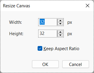
Use this when:
You want to expand or crop the drawing area
You need precise canvas dimensions without scaling the icon
Adjust Brightness and Contrast
To adjust the brightness and contrast of the entire icon:
– Shift+Ctrl+B
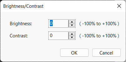
This tool lets you:
Modify brightness from -100% to +100%
Adjust contrast from -100% to +100%
Preview changes in real time on the canvas
This is useful for creating icon variants or adapting an icon to different UI themes.
Adjust Hue and Saturation
To modify the color tone and intensity of the icon:
– Shift+Ctrl+H
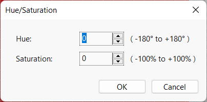
This dialog lets you:
Change the hue of the icon (from -180° to +180°), shifting all colors around the color wheel
Adjust saturation (from -100% to +100%) to make colors more vivid or more muted
See immediate results on the canvas
Use this tool to recolor icons for different UI states, themes, or brand palettes.
Adjust Color Levels
To control the dynamic range and brightness of your icon, you can adjust its color levels:
– Shift+Ctrl+L
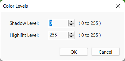
This dialog provides:
Shadow Level – The minimum brightness level. Raising this value darkens shadows and lifts blacks.
Highlight Level – The maximum brightness level. Lowering this compresses highlights, darkening whites.
Adjusting levels helps enhance contrast and correct icons that are too washed out or too dark. This is useful for preparing icons for different visual environments such as dark or light user interfaces.
Desaturate Icon
You can remove all color from the icon, converting it to grayscale using the Desaturate command:
– Shift+Ctrl+T
This operation sets the saturation of all colors to zero, preserving lightness and contrast but removing hue information. This results in a black and white icon.
Desaturation is particularly useful when designing icons for disabled UI states, monochrome themes, or printing.
Invert Colors
You can invert all the colors in your icon using the Invert Colors command:
– Shift+Ctrl+V
This operation replaces each color with its complement — for example, blue becomes orange, black becomes white. This can be helpful for testing visibility in alternate themes or creating contrast variants of your icon.
Make Hot Version
Create a vivid and visually emphasized version of your icon with the Make Hot Version command:
This function automatically increases the icon’s brightness, contrast, and saturation levels, resulting in a more vibrant version of the design. This is particularly useful for interactive interfaces where an icon needs to react to user input.
The Hot Version is typically used as a visual response when the user hovers the mouse cursor over the icon, making it appear active or selected.
The transformation is non-destructive — the original icon remains editable, and you can adjust the result further using color tools like:
Hint
This command is part of the UI State Variant generation workflow, where icons are prepared in multiple states such as normal, hot, and disabled.
Make Disabled Version
Generate a muted and semi-transparent version of your icon with the Make Disabled Version command:
This command transforms your icon to represent a disabled or inactive state by applying two visual effects:
Desaturation — Removes all color by reducing saturation to 0%.
Opacity Reduction — Sets the icon’s opacity to 50%, giving it a faded appearance.
This is commonly used in UI design to indicate that the icon or button is unavailable or cannot be interacted with.
Hint
Use this function alongside Make Hot Version to quickly build a full set of state-based icon variants (normal, hot, disabled) for your application interface.
Make Dark Theme Version
Use the Make Dark Theme Version command to automatically adjust your icon for use on dark backgrounds:
This command processes the icon’s colors to invert lightness while preserving hues and saturation. The result is a version of the icon with enhanced contrast and visibility on dark or black UI themes.
This operation is useful when preparing assets for apps that support both light and dark interface modes.
Hint
You can generate all necessary state and theme variants (normal, hot, disabled, dark theme) using the dedicated icon transformation tools under the menu.
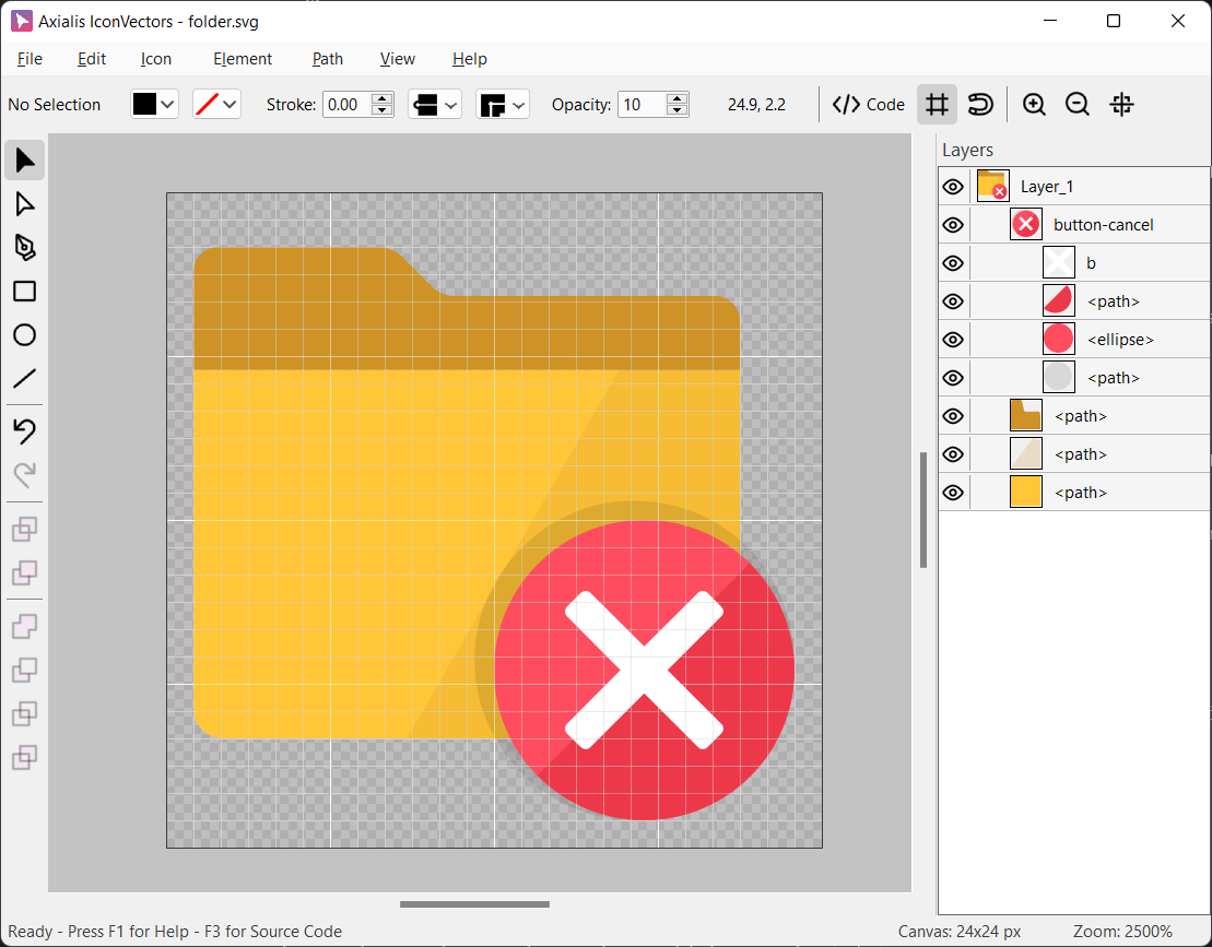
Add a Badge Overlay
Use the Add Badge Overlay command to enhance your icon with a small decorative or status badge:
– Ctrl+F7
This command opens a standard file dialog allowing you to select an external SVG file (badge). Once selected:
The badge is inserted into the current icon.
It is automatically resized and positioned in the lower-right corner of the icon.
If the badge contains strokes, their line widths are preserved to match the style and scale of the base icon.
This feature is commonly used to add visual indicators such as “new”, “error”, or “warning” markers to icons:
You can combine it with the following related commands for best results:
– Clears space underneath the badge for better visibility.
– Adds a subtle shadow to distinguish the badge.
Hint
The overlay is added as regular grouped SVG elements, which you can move, scale, or modify like any other part of the icon.
Make a Badge Overlay Cutout
When you add a badge overlay to your icon (such as a small symbol or status marker), part of the original icon may interfere visually with the badge. To solve this, use the Badge Overlay Cutout feature:
– Ctrl+F6
This command automatically cuts out a space around the badge overlay, ensuring it stands out clearly. It works by performing a series of actions:
A copy of the selected elements is merged to form a mask.
The mask is expanded to include extra space around the badge.
The mask is applied to the icon to create the cutout area.
You can specify the space width in pixels around the badge overlay using the dialog. This fine-tuning ensures the badge is always readable and unobstructed.
Here is a live demo of an application window with a badge overlay added. The cutout function will add a 1.5px width space aroude the badge:
Use in combination with:
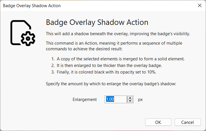
Add a Badge Overlay Shadow
The Add Badge Overlay Shadow command improves the visibility of a badge by adding a soft shadow beneath it:
– Ctrl+F7
This command performs a series of steps to generate the shadow effect automatically:
A copy of the selected badge elements is merged into a solid shape.
This shape is then enlarged to create a subtle border around the badge.
Finally, it is colored black and its opacity is set to 10%, creating a faint shadow behind the overlay.
The following dialog lets you customize the size of the shadow expansion:
You can specify the enlargement amount in pixels to control how prominent the shadow appears.
Use in combination with: