


Icon design is an essential yet often overlooked aspect of user interface (UI) design. Icons play a pivotal role in enhancing user experience, guiding users through an interface with visual cues. Mastering the art of icon design involves adhering to key principles that ensure effectiveness and aesthetic appeal.
Icon Meaning
When making icons, the most important thing is clarity of meaning. Users should easily understand what an icon means without having to think hard about it. The design should focus on what the user knows and where they will see the icon.
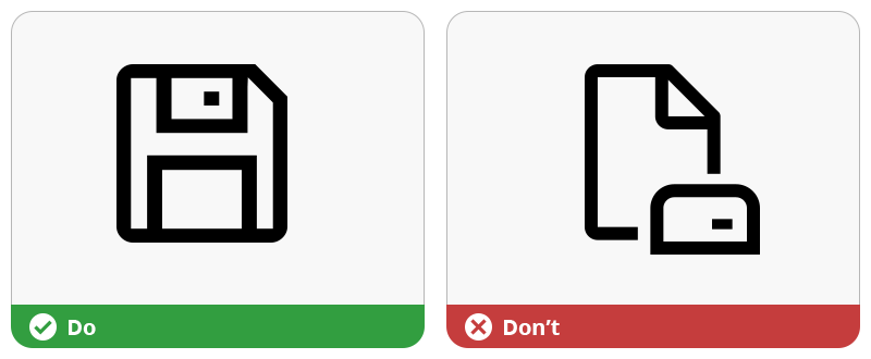
Design your icons so that users understand their meaning at first sight
For example, in an application managing documents, using a floppy disk to represent the action of saving a document is a good idea because everyone knows that floppy disk were used to save files. Even if the object now obsolete, it is obvious for users that it means “saving”. Making icons that people can recognize right away is key to good design:
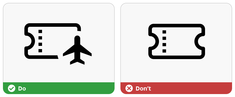
However, when crafting unique icons, the challenge intensifies. It’s essential to anchor these icons in some familiar visual language or accompany them with text.
Take the example of a ticket icon in a travel app. While unique, it’s paired with an overlay badge for clarity. This blend of the familiar and the new is a delicate but crucial balance in icon design:
Visual Simplicity
Icons need to be easy to see and understand, just like how text should be easy to read. They should be made simple and clear, not too detailed, so they don’t look like a blur when small. Think about how important it is for icons to be simple and show their meaning right away.
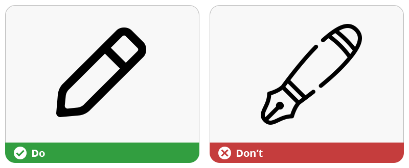
“Less is more” is true for UI icons too!
For example, a basic pencil icon shows the idea of “editing” or “modifying” better than a fancy, detailed one. The goal is to make sure that the icon’s meaning is clear and easy to get right away:
This principle is particularly evident when comparing icons with varying levels of detail. A complex icon might capture more nuances, but a simpler icon often communicates more quickly and effectively. The art lies in eliminating the unnecessary, leaving only what’s essential to convey the message.
Familiarity for Intuitive Use
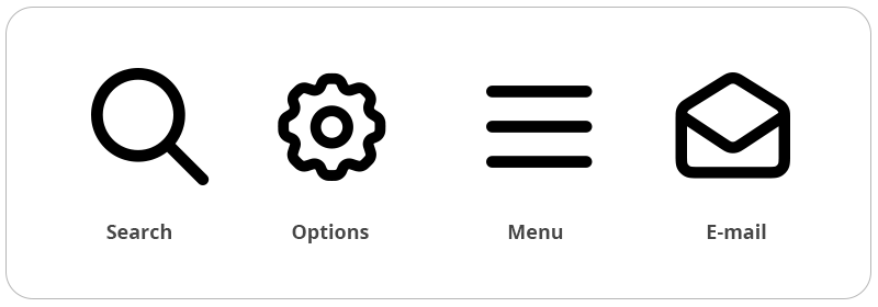
Familiarity in icon design uses what people already know to make interfaces easy to use and understand. That’s why some icons are known everywhere, like the magnifying glass for search or the envelope for mail. These symbols are so well-known that almost everyone understands them, no matter their language or culture.
Familiarity doesn’t stop creativity. It means using symbols people know well as a starting point, and then adding more to make something special that fits the brand and product. When designers start with what users know, they can lead them into new digital experiences that are easy to get used to.
Use familiar icons to illustrate the most common functions
Consistency Matters
Consistency means making sure that all the icons in a system look like they belong together and follow the same style and rules. This makes it easier for users to understand and use the interface.
For instance, if every traffic sign on the road looked completely different, it would be really hard to understand what each one means. But because they have a consistent style, we can quickly recognize them and know what to do.
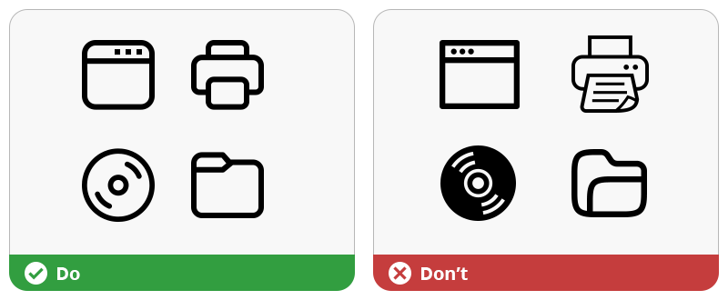
Similarly, in user interfaces, consistent icons help users quickly find what they need and understand how to use the software without getting confused. In the illustration below, icons on left are consistent. They were designed with the same style (line thickness, corner roundness, proportions). They all come from the same icon set Axialis Fluent System 2023. On right, icons have mixed styles:
Consistent icons also make a user interface look more professional and polished. It’s like having a neat, well-organized room where everything matches and looks good together. This doesn’t mean that all icons have to look the same, but they should share some common features like color, size, or line thickness.
Application Identity
User interface icons play a crucial role in giving personality to an application. They are like the unique features of a person’s face, making a brand instantly recognizable and memorable. When an application has its own set of custom icons, it sets itself apart from others, telling its own story and conveying its values and style.
For instance, when designing apps for use in administrative offices, it’s smart to choose icons that resemble those in Microsoft Office programs. An example of this approach is an application utilizing Axialis Office Pro 2019 icons:
This facilitates user comfort in a familiar environment. All icons are instantly identifiable, and each function is intuitively understood upon first glance.
How to Refresh your Application with New Icons
There are a few different methods to make your own icons, depending on your project needs, your budget and your skills:
Make icons from scratch with a vector editor
This gives you a lot of freedom but takes the most time and skill. Popular vector design tools include are Adobe Illustrator, Sketch and Inkscape (which is free).
Choose ready-made icons from big online libraries
Sites like Iconfinder, The Noun Project and Flaticon offer millions of icons. You can pick an icon, download it, and tweak it using a vector editor. These icons aren’t usually perfect for precise work and are better for illustrations.
Use icon generator software
This is great if you don’t have much drawing experience. Tools like Axialis IconGenerator provide a collection of ready-to-use icons. They have customization options (like changing colors and adding effects) and help you make precise icons easily for your app in a matching style. There are many themes available, but if you can’t find the exact icon you need, you can modify or create new ones.
Hire a designer for custom icons
If you want unique icons but can’t make them yourself, hiring a designer is a great choice. It ensures high-quality results but can be quite costly.
Using an icon generator software is the easiest and most affordable way to create pixel-perfect vector icons for your application.
Create Icons with Axialis IconGenerator
Axialis IconGenerator lets you create State-of-the-art Vector Icons for your Application in the style of your choice with ease. This can be done in a few minutes:
- Create a new collection.
- Select the icon set in the desired style
- Choose the icon you want to generate in the list. Optionally, you can add an overlay modifier and choose where to apply it. You can also colorize the icon and/or the overlay.
- Add the icon to the collection. This can be done by drag & drop as well.
- Click “Create Collection Icon Files“. Choose where to generate the icons and select the formats you want to generate. Click OK.
- The icon are generated. Now you can explore the folder where it is located and use them in your application project.
Conclusion
Mastering icon design is a blend of art and science, requiring clarity, simplicity, familiarity, alignment, and a touch of branding magic. By following these principles, UI designers can create icons that are not only visually appealing but also intuitive and effective in communication.