Generating icons
IconGenerator is designed to generate complete icon families quickly: select icons (and optional overlays), preview the result, then export all required formats and sizes in one operation.
This page focuses on generating icon files. For an overview of the two main workflows (generate directly vs. build a collection), see Workflow.
Select base icons and overlays
Choose an icon set and a category in the Icon Sets panel.
Select one or more icons in the icon list.
Use Ctrl and Shift to select multiple icons.
(Optional) Select one or more overlays in the Overlays panel to illustrate an action or a state (Add, Remove, Warning, Error, etc.).
The Generated Icons panel shows a live preview of the current selection.
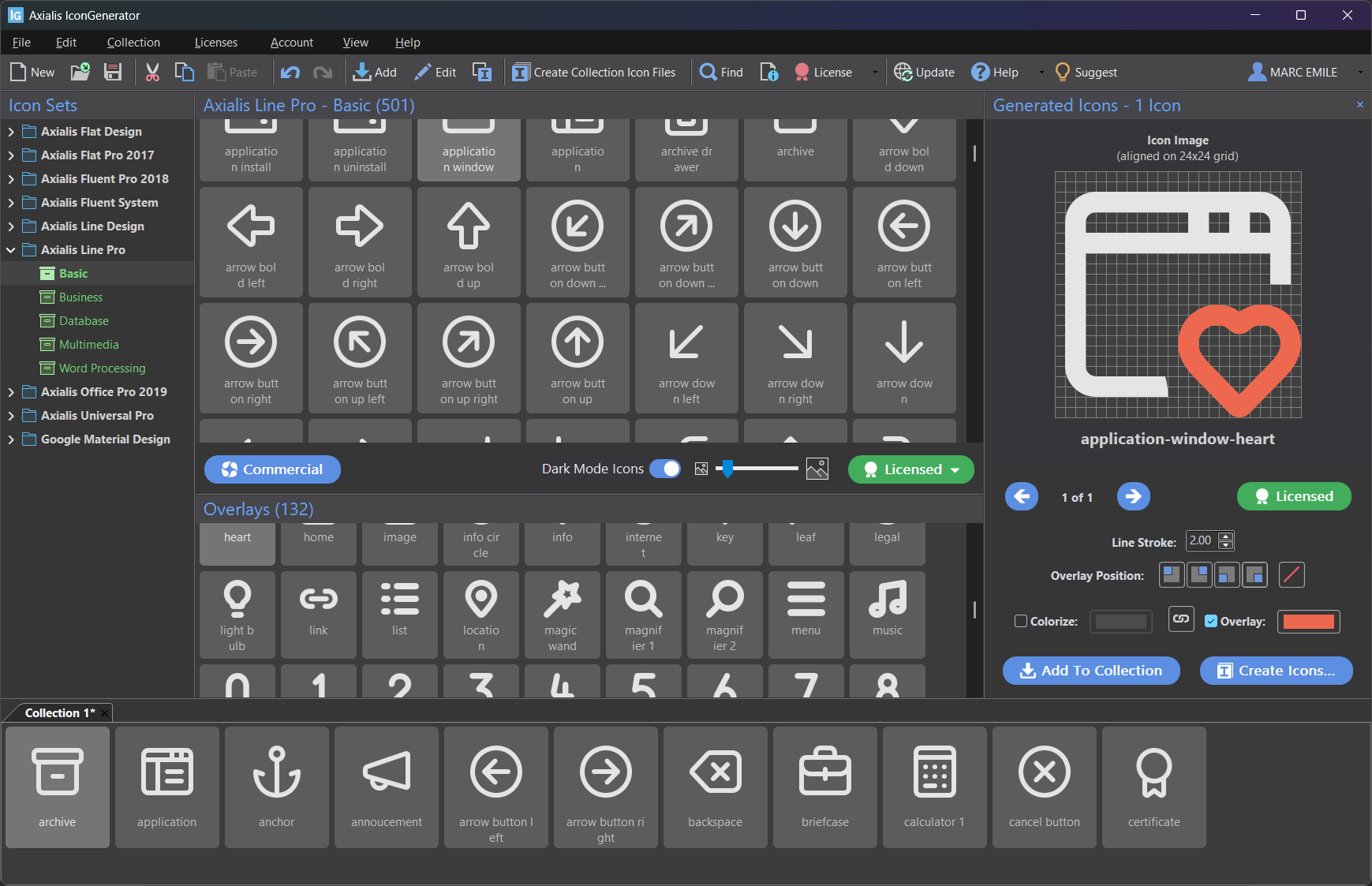
Selecting icons and overlays. The result is previewed in the Generated Icons panel.
Note
If you don’t see the Generated Icons panel, enable it with F11.
Browse generated combinations
When several icons and overlays are selected, IconGenerator generates combinations.
Example:
5 selected base icons
3 selected overlays
This produces 5 × 3 = 15 generated icons.
Use the left/right navigation buttons in the Generated Icons panel to browse the generated results.
Adjust overlays and colors before export
Before exporting files, you can fine-tune how the generated icons look:
Overlay position: place the overlay in one of the four corners.
Colorize: apply a solid color to match a theme or brand color.
Overlay color: optionally colorize overlays differently from the base icon (useful for status overlays).
Overlay position shortcuts (F5 to F8) are focus-dependent:
If focus is in the Icon Collections area, they apply to the selected collection icons.
Otherwise, they apply to the selection in the Generated Icons panel.
For full details, see Adding Overlays and Colorizing icons.
Properties, vector code and quick actions
Properties
To view detailed information about a generated icon (including vector code for SVG/XAML):
Right-click in the Generated Icons panel to open the context menu.
Choose Properties.
You can also use:
Alt+Enter
The Properties dialog typically includes:
Icon name and source set information
License information (depending on the icon set)
An Image tab with SVG and XAML code for vector formats
Quickly save a single icon
To save one generated icon without running a full batch export:
Right-click in the Generated Icons panel.
Choose Save Image As…
Select the desired format and follow the standard save procedure.
Quickly copy an icon to the clipboard
To copy vector code or a bitmap image:
Right-click in the Generated Icons panel.
Choose Copy Image As…
Select a format:
SVG/XAML code is copied as text.
Bitmap formats are copied as an image.
Create icon files from generated icons
There are two equivalent ways to export files from the current selection:
Click Create Icons… in the Generated Icons panel.
Use F3
The dialog below lets you choose the destination folder, formats, sizes, and options.
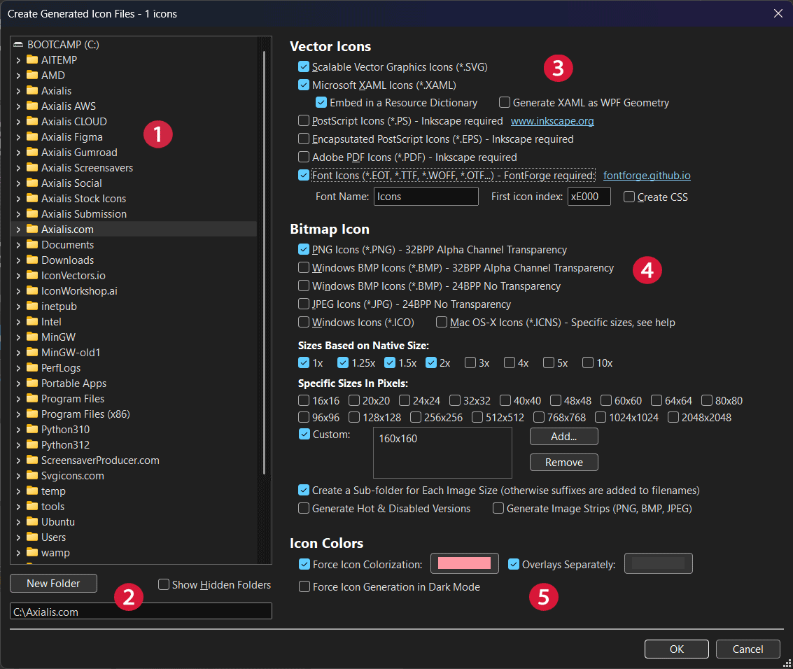
Create Generated Icon Files dialog (numbers are referenced below).
1) Select the target folder
Use the folder tree (①) to select where files will be generated.
The output path is also shown in the destination field at the bottom.
Enable Show Hidden Folders if you need to export to a hidden directory.
2) Create a new folder (optional)
If you want a dedicated output folder, click New Folder (②) and enter the folder name.
3) Choose vector formats
In the Vector Icons section (③), select the formats you need.
Scalable Vector Graphics Icons (
*.SVG) Generated by IconGenerator directly (no external dependency).Microsoft XAML Icons (
*.XAML) Additional options may be available:Embed in a Resource Dictionary: generate XAML resources that can be merged into WPF resource dictionaries.
Generate XAML as WPF Geometry: export the drawing as WPF geometry primitives (useful for styling in WPF).
PostScript (
*.PS), Encapsulated PostScript (*.EPS), Adobe PDF (*.PDF) These formats require Inkscape (the dialog displays the requirement).Font Icons (
*.EOT,*.TTF,*.WOFF,*.OT...) This option requires FontForge (the dialog displays the requirement). When enabled:Font Name: the name assigned to the generated font.
First icon index: the first Unicode code point used for the generated glyphs (example:
0xE000).Create CSS: generate a CSS helper file (useful when using the font in web projects).
Note
Each selected vector format is exported into its own subfolder inside the destination folder.
4) Choose bitmap formats and sizes
In the Bitmap Icon section (④), select one or more bitmap formats:
PNG (32-bit with alpha transparency)
Windows BMP (32-bit with alpha transparency)
Windows BMP (24-bit, no transparency)
JPEG (24-bit, no transparency)
Windows Icons (
*.ICO)Mac OS-X Icons (
*.ICNS)
When at least one bitmap format is selected, you can choose sizes in three ways:
- Sizes based on native size
Use scale factors (for example 1×, 2×, 3×…). The pixel dimensions depend on the native size of the icon set.
- Specific sizes in pixels
Select common pixel sizes (for example 16×16, 24×24, 32×32, …).
- Custom sizes
Enable Custom, then use Add… / Remove to maintain a list of custom sizes.
Tip
For .ICO and .ICNS generation, select the standard sizes your target platform expects.
(These formats usually bundle multiple sizes together.)
Bitmap generation options
Below the size selection, additional options control how bitmap files are organized and generated:
Create a Sub-folder for Each Image Size When enabled, each size is written into a dedicated subfolder (recommended for clean output folders). When disabled, all sizes are written into the same folder and the size is appended to the filename.
The separator character used in filenames can be configured in Preferences (see Icon format separator character).
Generate Hot & Disabled Versions Generates additional variants intended for UI states (for example hover/hot and disabled/greyed).
Generate Image Strips (PNG, BMP, JPEG) Creates “strips” (a single image containing all generated icons in a row), useful for toolbars and image lists.
5) Set additional options
In the Icon Colors section (⑤), you can control colorization:
Force Icon Colorization Forces a solid color for generated icons. Click the color swatch to pick the desired color.
Overlays Separately Allows you to color overlays with a different color than the base icon (useful for status overlays).
Force Icon Generation in Dark Mode Generates icons in dark mode style when the selected icon set supports dark mode rendering.
When ready, click OK to generate the icon files.
Generate icon files from a collection
To export icon files from the current collection (.AXICP):
F4
The export options are similar to those used for generated icons, but the input comes from the icons stored in the collection (including any overlays already applied and their positions).