Adding Overlays
Overlays are small symbols you can place on top of a base icon to communicate an action or a state.
Typical overlay meanings include: Add, Remove, Edit, OK, Info, Warning, Error, etc. Using overlays is a fast way to create consistent “annotated” icons without drawing new artwork.
Overlay basics
Overlays are optional.
Overlays are usually provided in the same style as the icon set you are using (stroke weight, corner radius, etc.).
You can select one overlay (for a single annotated icon) or multiple overlays (to generate variants).
Tip
If you select multiple base icons and multiple overlays, IconGenerator generates all combinations.
Example: 5 icons × 3 overlays → 15 generated icons.
Where to select overlays
Overlays are selected from the Overlays panel in the main window.
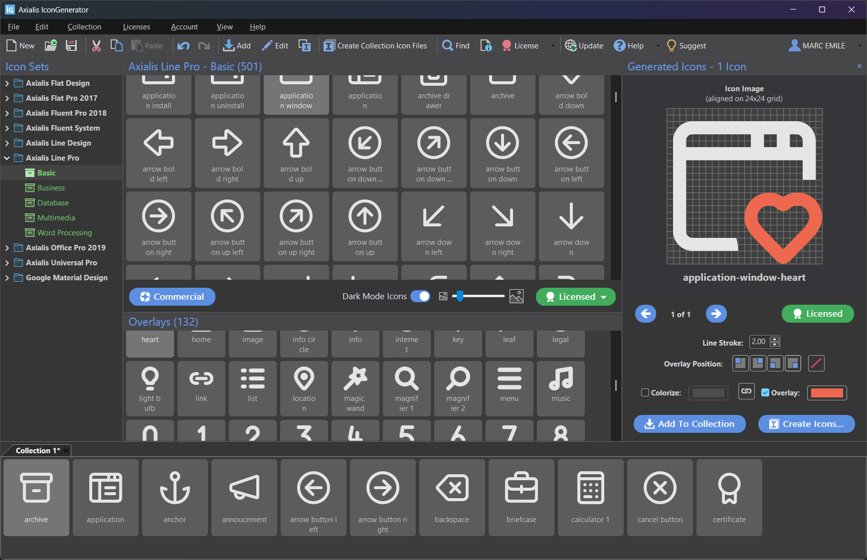
The Overlays panel lists overlay symbols available for the current icon style.
To select overlays:
Click an overlay thumbnail to select it.
Use Ctrl and Shift to select multiple overlays.
Note
The available overlays depend on the icon family/style currently selected. Not all sets provide the exact same overlay list.
Apply overlays to generated icons
The Generated Icons panel displays a large preview of the currently generated icon and provides controls for overlay placement and colorization.
If the Generated Icons panel is hidden, show it with:
F11
Overlay controls in the Generated Icons panel
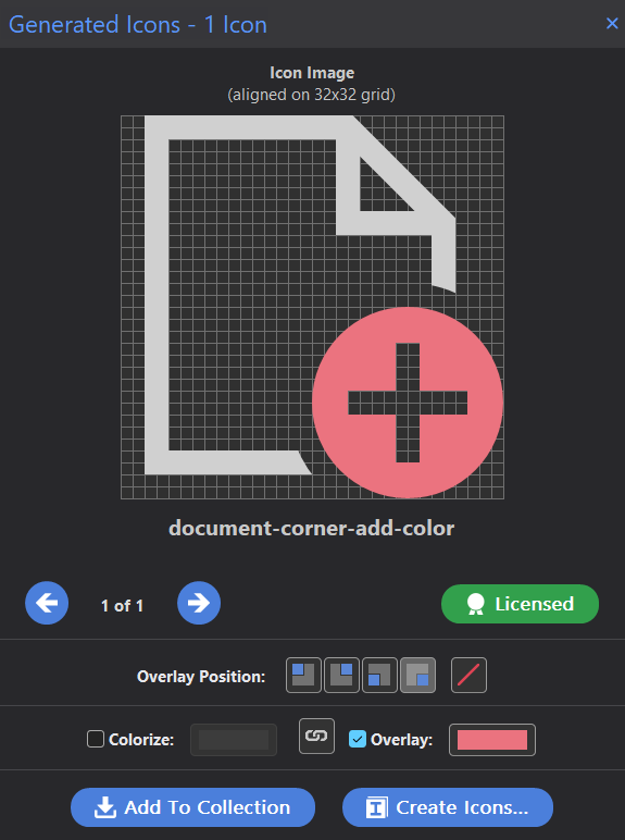
The Generated Icons panel: overlay position buttons and separate overlay color.
In this panel you can:
Change the overlay position (four corner buttons).
Remove the overlay (the slash button on the right of the position buttons).
Colorize the base icon, the overlay, or both (see Colorize overlays and icons).
Overlay positions
Overlays can be placed in four positions (the corners of the icon):
Top-left
Top-right
Bottom-left
Bottom-right
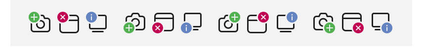
The four overlay positions.
Change overlay position
You can change the overlay position using either:
The position buttons in the Generated Icons panel, or
The Collection menu (useful when working on a collection)
Focus-dependent shortcuts
The overlay position shortcuts F5 to F8 are focus-dependent:
If focus is in the Icon Collections area, they apply to the selected icons in the collection.
Otherwise, they apply to the current selection in the Generated Icons panel.
This makes it easy to use the same shortcuts in both workflows.
Colorize overlays and icons
IconGenerator lets you colorize:
the base icon,
the overlay,
or both at the same time.
In the Generated Icons panel (see screenshot above):
Colorize controls the base icon color.
Overlay controls the overlay color.
The link button between the two color controls lets you choose whether icon and overlay share the same color or use separate colors.
Typical usage patterns:
Status overlay: keep the base icon neutral (no colorize), colorize the overlay (for example red for error, green for success).
Monochrome UI: colorize both icon and overlay with the same theme color.
Two-tone UI: colorize the base icon with the UI theme, colorize the overlay with a contrasting status color.
Note
The export dialog also provides options to force icon colorization and to color overlays separately. See Export formats and options for details.
Overlay clipping and compatibility (vector exports)
When an overlay overlaps the base icon, IconGenerator can improve the rendering by creating a clean cut-out under the overlay area (instead of relying only on masks). This is especially useful for vector exports where some UI frameworks have limited mask support.
You can choose the method in Preferences:
F2
Go to the Overlays tab.
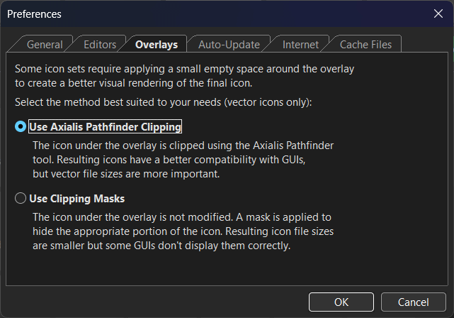
Preferences: choosing how overlays are clipped for vector icons.
Two methods are available:
Use Axialis Pathfinder Clipping
The icon under the overlay is clipped using the Axialis Pathfinder tool.
Resulting vectors usually have better compatibility with GUIs and rendering engines.
Vector file sizes can be larger.
Use Clipping Masks
The base icon is not modified.
A mask is applied to hide the part of the icon under the overlay.
Vector file sizes can be smaller, but some UI frameworks may not display masked icons correctly.
Tip
If you do not notice any difference when switching between the two methods, the current icon set probably does not require overlay clipping for its overlays.
Best practices
Prefer overlays from the same icon family as your base icons (consistent style).
Keep overlays simple and meaningful at small sizes (especially 16×16 and 24×24).
Use overlay color sparingly: reserve strong colors for “status” meaning (error/warning/ok).
If you are exporting for a UI framework with limited SVG/XAML support, prefer Axialis Pathfinder Clipping (see Preferences → Overlays).